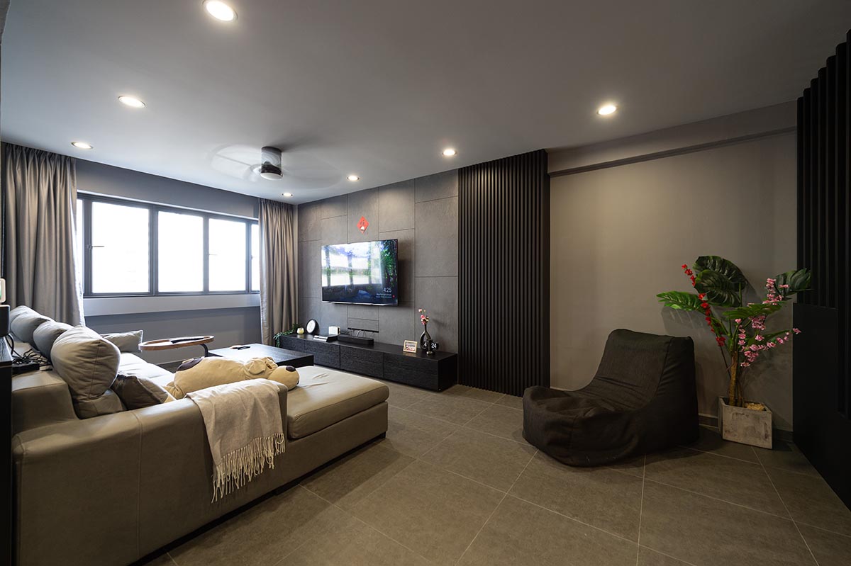
“I wanted to go for something scandi… but not too scandi!” Fizah said with a laugh, as she brought us around her family’s 5-room flat in Bukit Batok.
In principle, the flat’s neutral palette, which comprises a range of white, beige and grey, adheres to the ‘Scandinavian’ look. But it is the unique furniture and pops of colour interspersed throughout the flat that make it truly eclectic. Everything seemed to come together so effortlessly to exude a homely vibe, resulting in a bespoke home that the owners truly call their own.

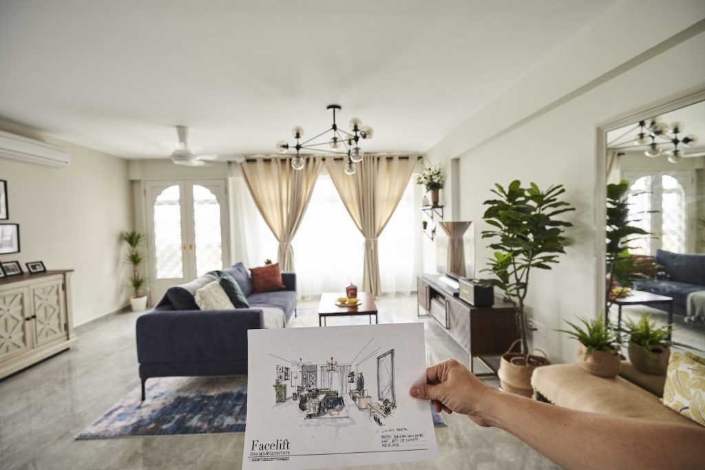
Fizah and her husband Khairul’s renovation journey lasted all of 7 months. But they were really satisfied with the outcome. They found an interior designer on Instagram (@faceliftdesign) and were instantly convinced that the designer was the right match for them. “She understood perfectly what we wanted, and her sketches were so detailed. And because she was very involved in the home-styling, our home turned out exactly the way she sketched it!” Fizah shared.

The original sketch by their interior designer before the renovation began

The couple spent about $60,000 on renovations, and this includes the project management cost and home-styling services. The renovation was a collaborative effort, with Fizah and Khairul consulting their interior designer before they bought any piece of furniture. Some of their shopping haunts include ECO links, Commune, Taylor B, King’s Living, and Nook & Cranny.
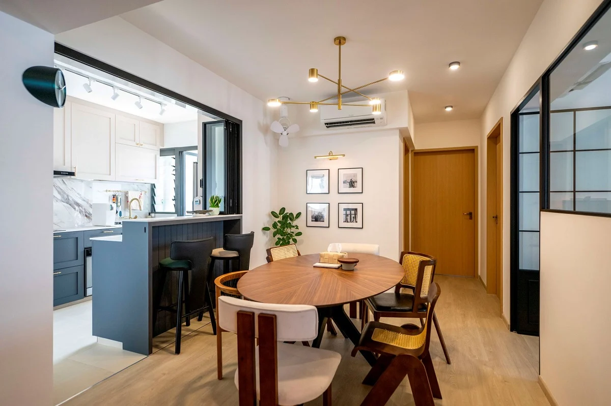
To save cost, the couple sourced their lighting fixtures and fans from Johor Bahru (JB). “We wanted a specific kind of lighting, which is really expensive in Singapore. So we decided to go to JB, and found alternatives at a third of the price,” they shared. Hints of navy blue appear as accents throughout the home; it’s a colour Fizah says she will not get bored of.


A navy laminate for the kitchen island adds a pop of colour in the neutral-toned space


In their bedroom, a red patterned wall stands out as a stunning feature, adding colour and character to the room. “We originally wanted a brick feature wall, but that would have meant busting our budget,” shared Fizah. Working within their budget, their interior designer proposed using patterned wallpaper instead, and this turned out to be among the best decisions they made.

The couple opted for a red, patterned wallpaper for the feature wall in their bedroom

Meanwhile, things are kept simple, but no less striking, in their son’s bedroom. Black-and-white decals from IKEA adorn the walls, and a handy storage trolley keeps the area clutter-free.

A “Scandi” home with personal touches that make for a warm and cosy home they look forward to returning to every day.
