Come journey with us into the homes of HDB residents in this 3-part series, and witness the transformation of their flats into beautiful homes!
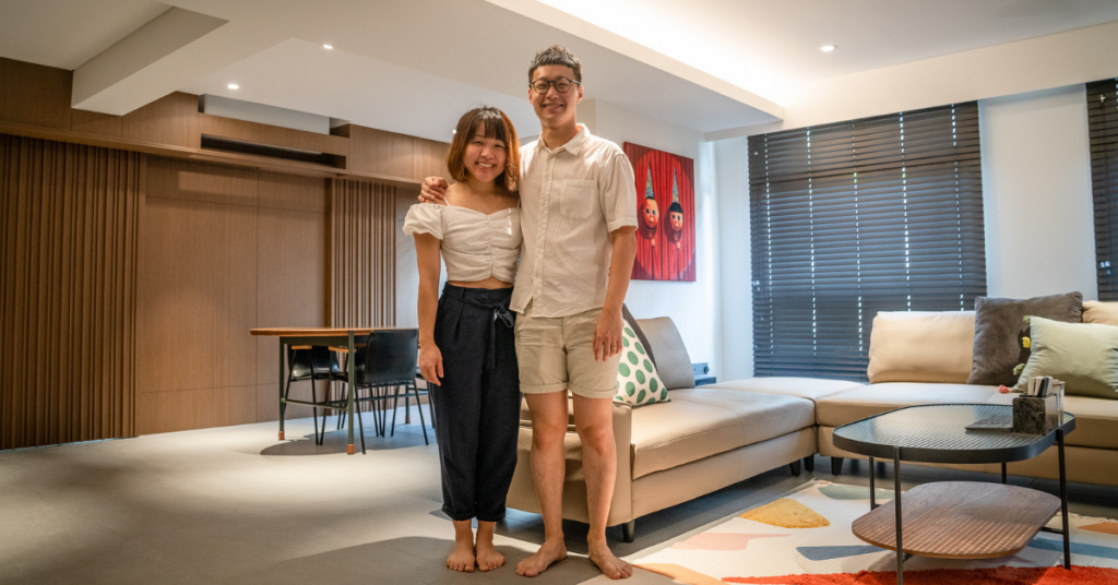
Homeowners: Geoffrey and Sian Ching
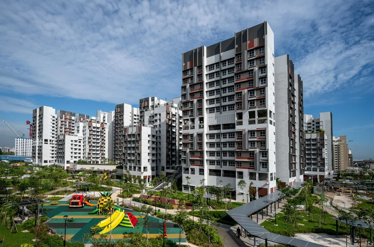
Town: Tampines
Flat type: 5-room BTO
In the final part of this series, Sian Ching and Geoffrey bring us on a tour of their recently-completed home. Get acquainted with the couple and their design process in part 1, and find out more about their renovations in part 2.


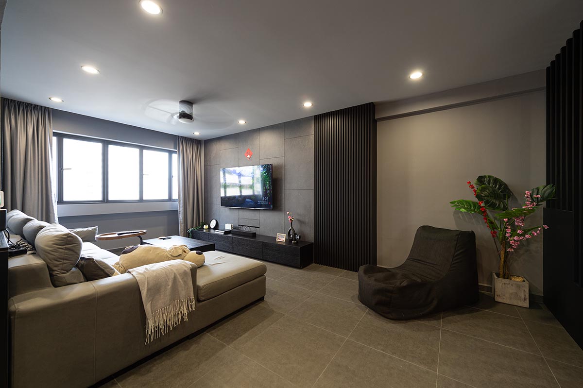
“We don’t have a specific interior theme – it’s a modern and timeless look that comprises black and wood accents,” Geoffrey and Sian Ching explains the look and feel they were aiming for in their new home.
Your house looks great! How did you achieve such a spacious living area?
Sian Ching: We hacked the wall of the first bedroom to create a bigger communal space. As we like having friends over, we made this design decision from the get-go.


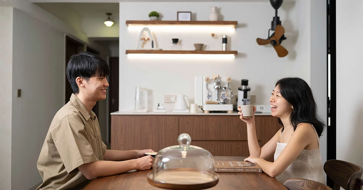
Sian Ching: We have different hangout spots to cater to different groups of guests and it’s interesting to see them gathering at the sofa, the dining area, and of course, the bar counter. The dynamic communal area enables guests to move around the house, which is what we had in mind.

It sounds like your house is the perfect place for a gathering (within the allowed group size, of course).
Geoff: Sian Ching enjoys hosting so we decided to extend the bar counter for more dining space. In the kitchen, the sink is also designed to be a little wider, to accommodate more dishes for washing-up sessions after playing host.


Can you tell us more about your customised carpentry works?
Sian Ching: To maximise the space, we opted for lots of full-height features – including the TV area. Instead of just a console, we created more storage space via nooks built into the wall.

Geoff: Another key feature of our home is the wooden wall that leads to the bedrooms. We concealed a door in the design, which separates the communal and private spaces while enabling a seamless transition between the two.

How did you achieve such a stylish look for your bedroom?


Sian Ching: We chose a darker colour palette for the bedroom as it provides a more relaxing environment. We used a combination of pendant lights, floor lamp and cove lights to keep the space cosy.

Geoff: You will notice that our toilet door and wardrobe are hardly distinguishable. We wanted everything to look flat, so the toilet door is on the same plane as the wardrobe. Both are also fabricated with the same material, to achieve a seamless look. We also shifted the position of our bedroom door to align it with the wardrobe.
