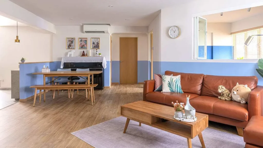
Jacqueline and Joey’s flat in Potong Pasir is inspired by their vacation to Greece, where they got engaged. “We adopted a Grecian colour palette in our home design to remind us of that special moment,” Joey smiles.

Purchasing Their First Home
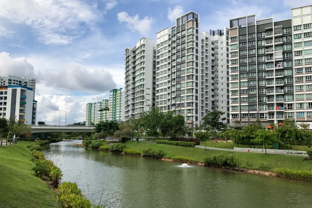
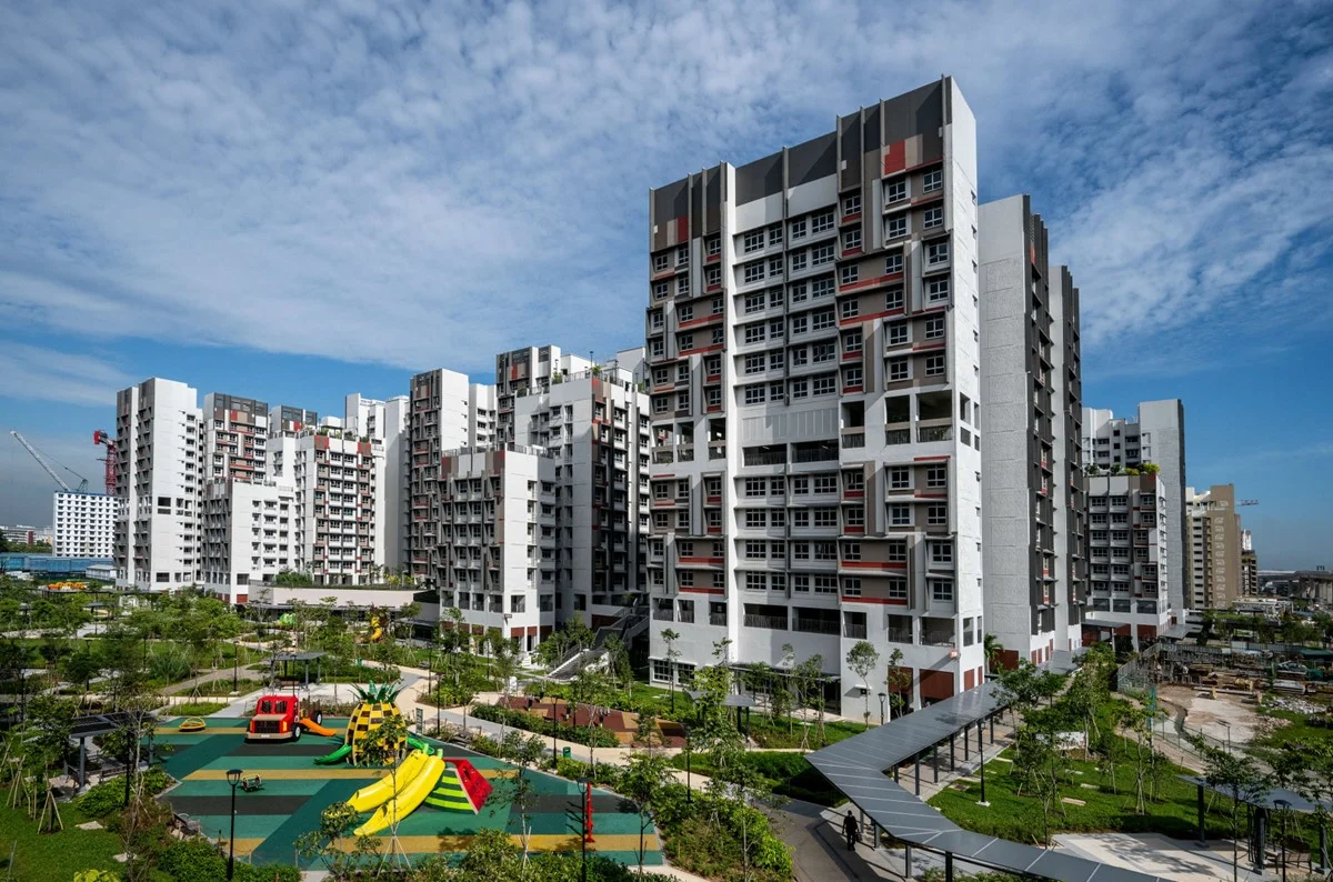
In searching for the perfect first home, Jacqueline and Joey considered their budget and location. “We wanted to be near my parents who live in Mountbatten. We were also uncomfortable with taking up such a big loan. Fortunately, we came across this unit which fits our requirements,” Joey says.
“We even managed to enjoy the Proximity Housing Grant. The grants helped to provide us with more breathing room in terms of financial planning, considering we also had wedding and renovation expenses to pay for,” he adds.

Photo: Adroit ID
A Complete Makeover
When deciding on the look and feel of their home, Jacqueline recalls the original idea was a Scandinavian, all-white look. However, after doing more research, they decided to go for something cosier and more colourful.
“The half-wall look is something I’ve always envisaged for our home because I like the idea of colour blocking. In addition to commemorating our time in Greece, blue is our favourite colour,” Joey says as he explains the inspiration behind the look.

Photo: Adroit ID
In the kitchen, the home owners opted for tall kitchen cabinets and pull-out storage units, as opposed to the conventional design featuring full top-and-bottom cabinets. “Apart from storing our pantry items and homeware, we wanted to conceal the otherwise exposed pipes with the floor-to-ceiling cabinets,” Joey explains.

In fitting out their kitchen, Joey and Jacqueline were toying with the idea of either an island or a bar table. They eventually picked a dining table and incorporated into their design, a preparation counter that acts as a pseudo island.

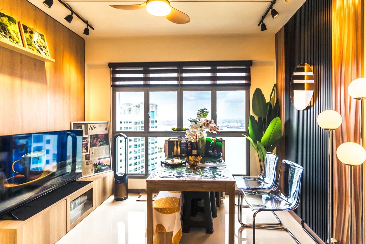
To make the best of the irregular layout in the home office, the couple made use of partitions to create a more even profile, as well as installed an indoor window to brighten up the room.

Photo: Adroit ID
In the master bedroom, a darker shade of blue was used to create a more restful ambience.

Photo: Adroit ID
In parting, Jacqueline says that one of the biggest challenges was finding a balance between the couple’s layout preferences and having a home in an ideal location. “That said, we’re really happy with our find. Our home has become a unique space for us, and has a lot more character we thought it would,” she smiles.
This article was adapted from a version first published on Qanvast.
For more interior inspiration, check out more Home Tours.
