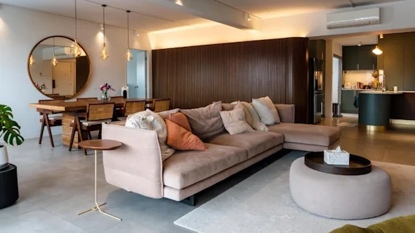
From the earthy colour palette to the breezy, sheer curtains that bathe the flat in natural light, it’s almost hard to believe that Joey and Huang Peng’s flat is located in Toa Payoh, and not in a more exotic locale by the beach.
Channeling Resort Vibes
It was love at first sight for the first-time home owners, who were drawn to the resale flat’s spacious and squarish layout. “When we were viewing the flat, we could already envision what our home would look like,” they recall.

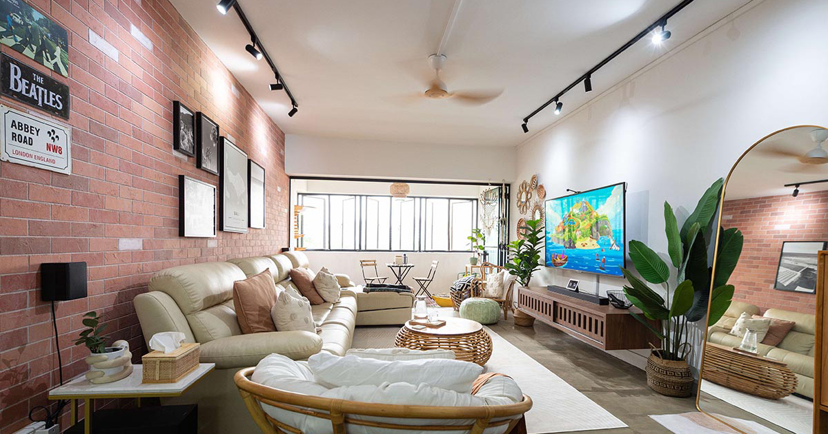
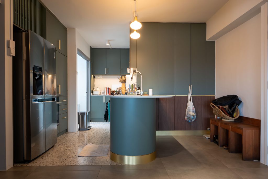
They combined the living and dining rooms, creating a villa-like open plan, and connected the open-concept kitchen seamlessly to this communal space. “The countertop is prep space and hangout spot all in one,” Joey says.
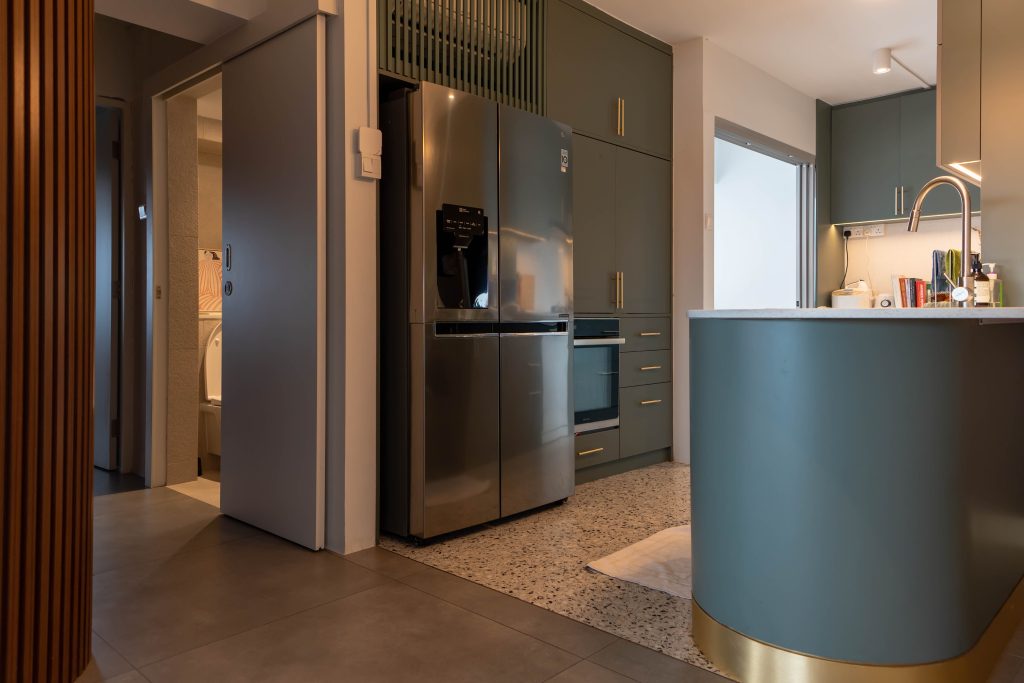
This layout creates a larger common space for hosting family and friends, and helps to keep the area cool through cross-ventilation, especially when the bi-fold balcony doors are open.
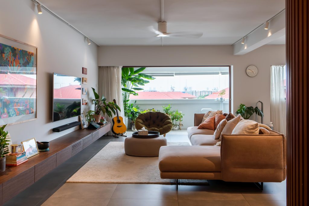
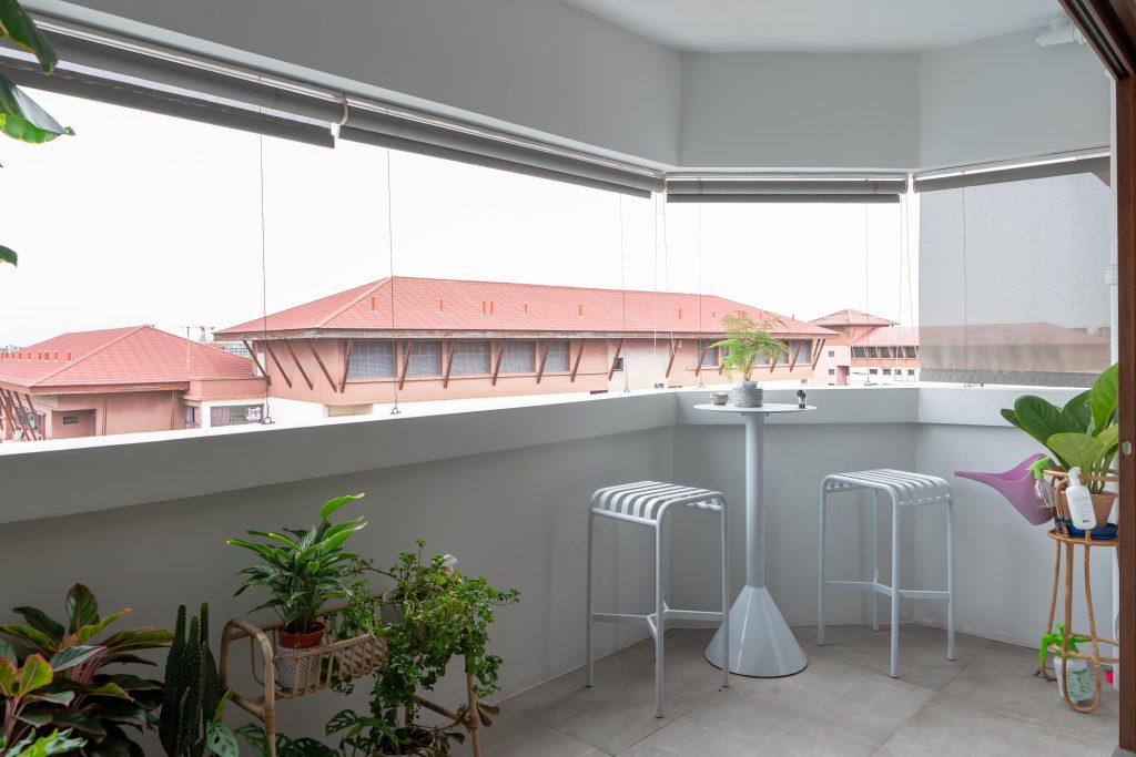
The balcony features a row of house plants, including an oversized banana tree that channels serious resort vibes. This cosy space is also furnished with a bar table and stools, where Joey and Huang Peng would occasionally spend their time unwinding after a long day.
Blending Old and New
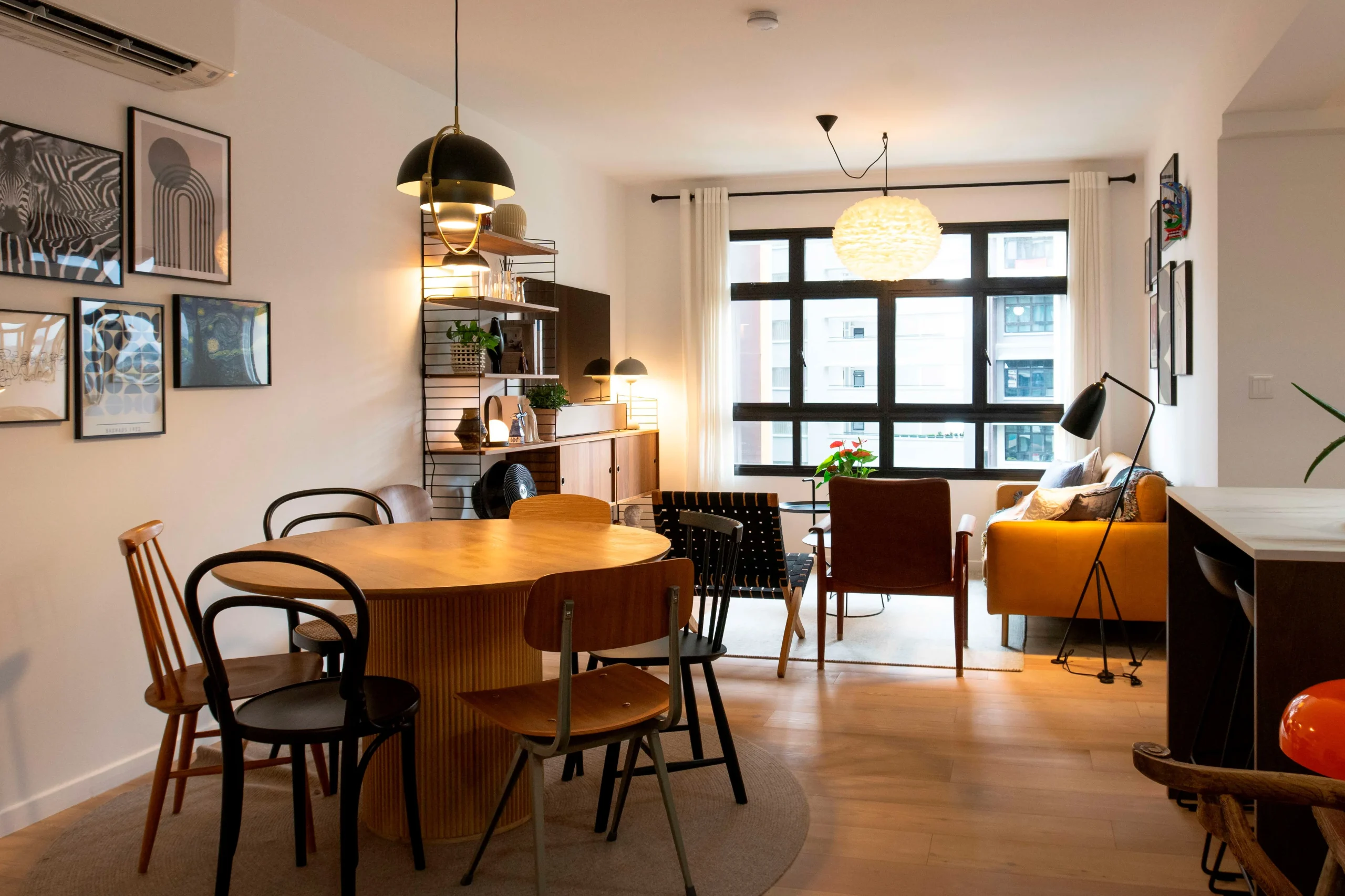
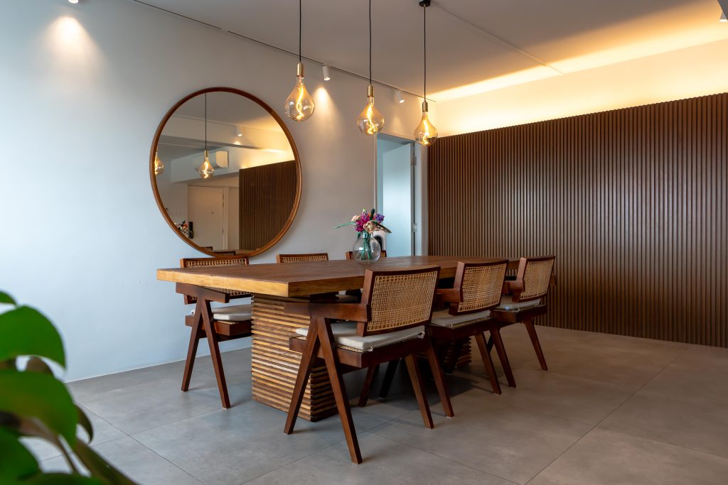
The balcony isn’t the only place to have a meal. Indoors, a dining set featuring rattan—a classic material enjoying a revival— adds a laidback charm to the home.
In the kitchen, terrazzo—another material making a comeback— feature in the floor tiles. Considering that the Huangs’ flat is 37-years-old, the heritage elements are a fitting nod to the ‘retro-ness’ of the flat.
“We embarked on our flat-buying journey knowing that we wanted a home for life, one that could accommodate our current lifestyle and grow with our needs,” they say. “Since we’re planning to make this flat our forever home, we made sure that the lease could cover us up to the age of 95.”
Place for Privacy and Rest
Their forever home is as aesthetically pleasing as it is functional. To carve out a little privacy in an open plan home, Joey and Huang Peng incorporated a partition wall, to demarcate the space between the bedrooms and common living area.
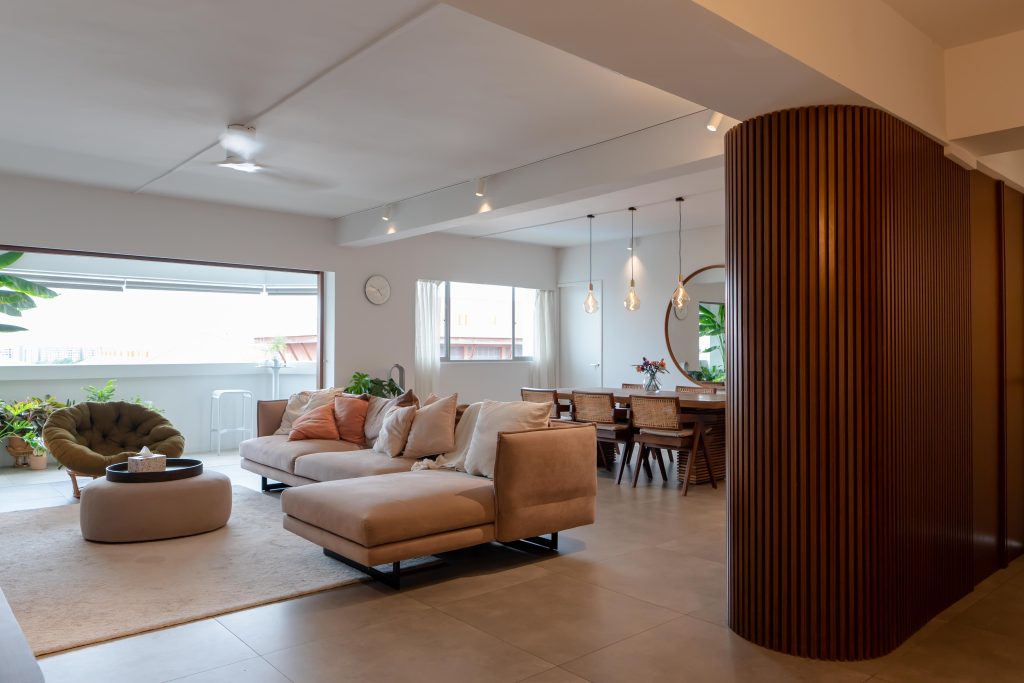
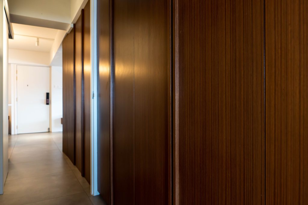
A combination of function and form, the partition doubles up as a storage space too. It is a statement piece – one of the interior design ideas suggested by the couple’s architect consultant.
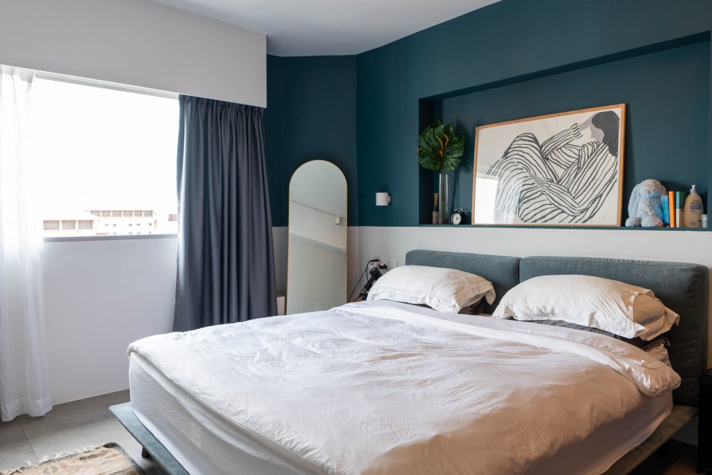
The private quarters of the home feel like a sanctuary. A darker shade of teal is used in the master bedroom to create a restful ambience, with the chic white sheets reminiscent of those in a resort. The bathroom sports a minimalist look, with grey subway tiles as its primary feature.
When recalling the renovation process, the couple emphasises, “It’s important to invest in quality materials, especially for built-ins and fixtures that are going to last you a long time. We always believe in putting functionality first – an important consideration we think home owners should take into account.”
Embark on more Home Tours or discover more interior design ideas here at MyNiceHome!
