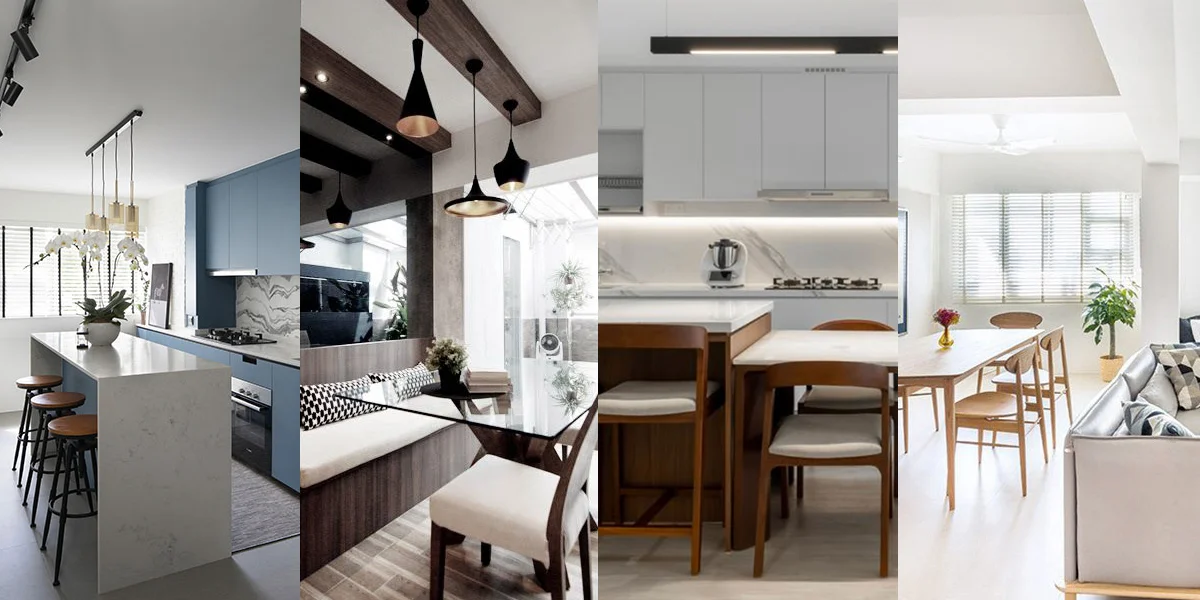
One major advantage of having wet and dry kitchens is the flexibility to tackle different types of cooking tasks in dedicated zones. Wet kitchens are for stewing, frying, and baking, while dry kitchens can accommodate ‘lighter’ tasks such as chopping vegetables or making a cup of coffee for a morning pick-me-up. These 10 homes are guaranteed to inspire your next kitchen makeover!
1. A Kitchen Bar Concept

Interior Firm: Hall Interiors
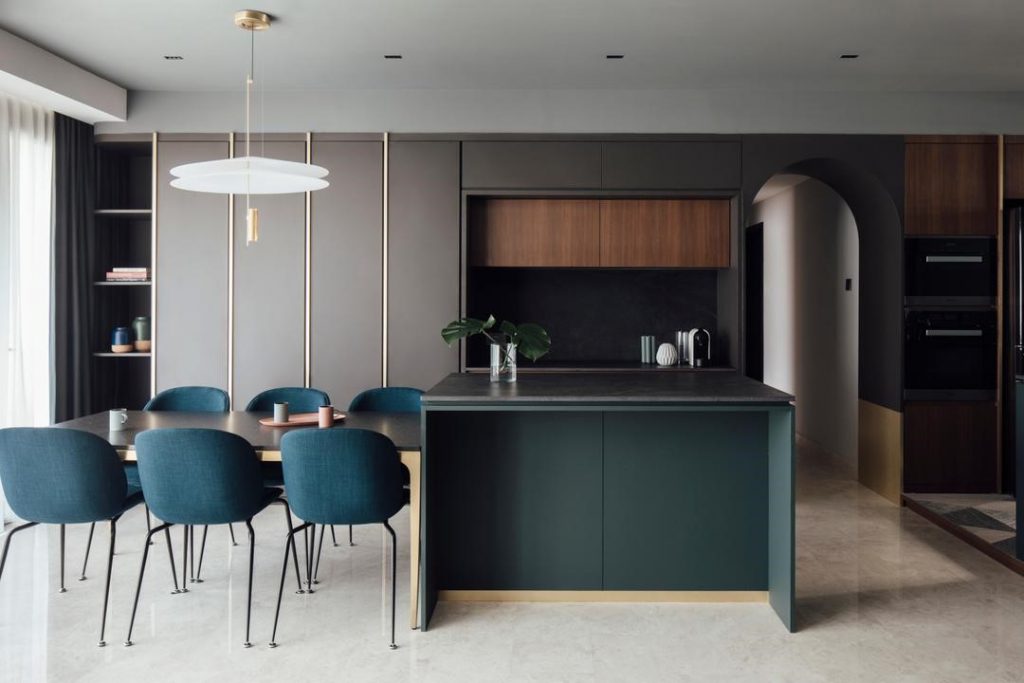
Dry kitchens are usually located close to communal areas and can be modified to become a dining/entertainment space for your guests. This classy dry kitchen with a galley-style layout accommodates a dining table, counter, storage spaces, and even a wine cabinet—talk about multi-functional!
2. A Compact Layout

Interior Firm: ARK-hitecture
Dry kitchens with a one-wall set-up are mighty useful if you would like to keep kitchen space to a minimum. These spaces are typically used for simple tasks, like brewing coffee or making sandwiches, unlike in wet kitchens where heavy-duty cooking is carried out.
3. A Food Prep Station

Interior Firm: DISTINCTidENTITY
While it might seem strange to have a food preparation counter in a communal zone, this idea is perfect for kitchens that are unable to fit a full island. It can also doubles up as a dining table, after the meal is prepared!
4. A Coffee Corner

Interior Firm: Ethereall
Of course, functionality is a top priority when designing your dry kitchen (layout, countertop material etc.), but this doesn’t mean you’ll have to compromise on aesthetics!
For the perfect coffee corner, opt for an in-cupboard niche! Not only does it add a dash of cosiness to your kitchen, the niche also makes for additional storage space. Add a splash of colour, such as a graphic backsplash or painting your cabinets a bold hue and watch your dry kitchen transform into the highlight of your home!
5. Storage Solutions

Interior Firm: Couple Abode
Dry kitchens are often compact spaces that are in full-view to all your guests, that’s why it’s super important to keep them neat. The easiest trick to hide the clutter in plain sight? Build a row of cabinets at the back. It will also make it easier to reach for your teacups/ pots/ coffee machine in the morning!
6. A Galley Kitchen With See-Through Doors


Interior Firm: Lemonfridge Studio
Splitting your kitchen into wet and dry zones could result in having spaces that look too confined and small on their own. Instead, opting for see-through doors can counter that problem as it creates the illusion of a bigger space.
7. The L-Shaped Layout


Interior Firm: The Local INN.terior
By adopting the L-shaped kitchen, this Tampines home managed to fit plenty of things in a compact space—top-and-bottom cabinets, a nook for a top-freezer fridge, and a breakfast counter.
8. A Scandinavian-Inspired Dry Kitchen

Interior Firm: The Design Practice
The best place for your dry kitchen? Beside the dining table! It can now double as extra serving space when you have guests over. Having an open concept layout is also handy as it makes passing dishes around much easier.
9. A Clear Divider

Interior Firm: BLACK N WHITE HAUS
If you’re leaning towards having an open concept kitchen, consider building a dry kitchen between a communal zone (e.g. the living room) and your wet kitchen as it can also serve as a subtle space divider.
10. An Organised Space


Interior Firm: Habit
While countertops are a mainstay feature of every wet kitchen, not every dry kitchen needs one, especially if you don’t have much space. In such cases, extendable shelves are a clever alternative.
This article was contributed by Qanvast, Singapore’s go-to renovation platform. Whether you’re embarking on a major overhaul or a simple refresh, Qanvast can connect you to the right professionals for the job. Read the original article on Qanvast.
