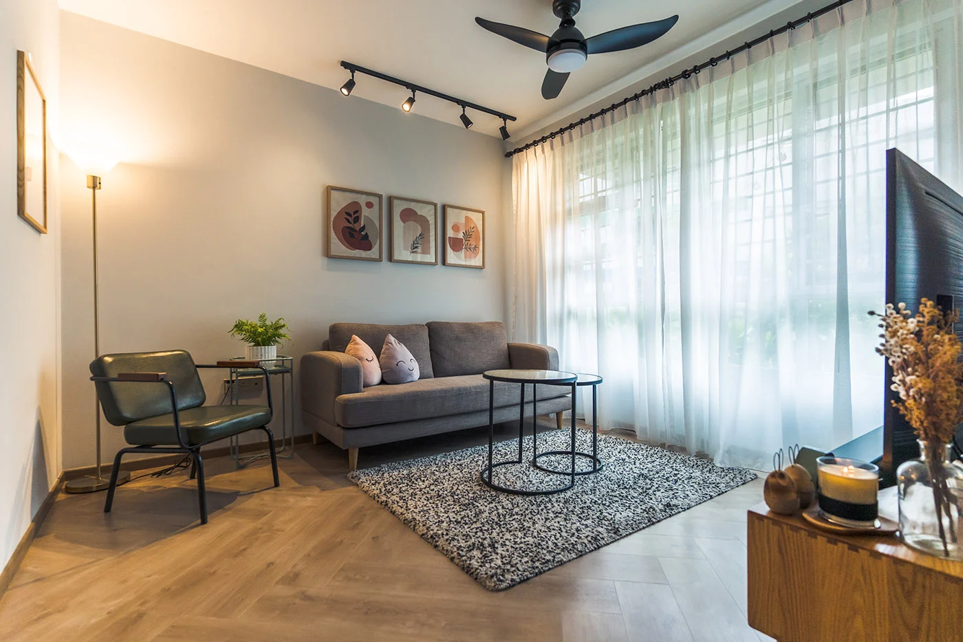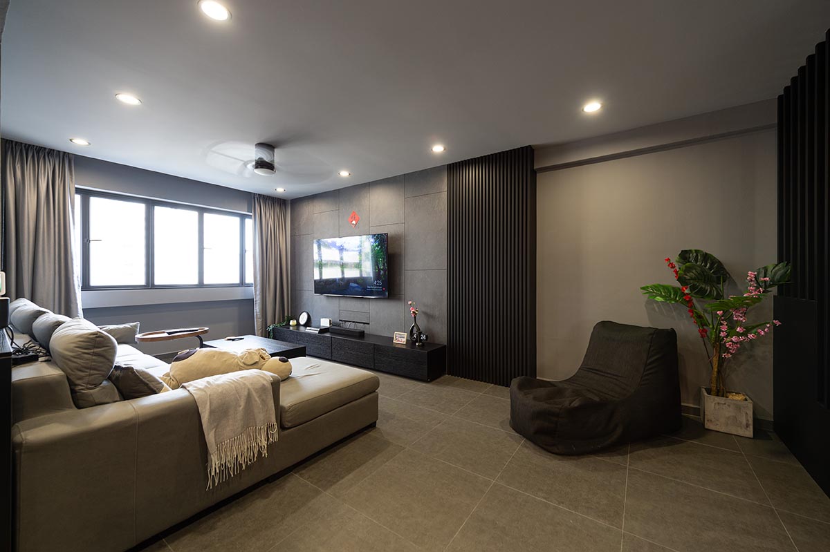
Drawn to the minimal and consistent look of a monochrome palette, Joanne Teo and Samuel Tan did up their home in shades of white, black and grey. The aesthetic is also inspired by the industrialist look, as seen from the concrete flooring and metal black accents that carry throughout the 3-room flat.

“We thought a monochromatic approach is the best way to achieve the modernist look we wanted,” the couple shares. “We also chose the colours for their versatility, as they can be complemented by most furnishings.”
Green and Sustainable Home Décor
Amidst the sea of grey, pops of colours are incorporated through decor such as plants and paintings, to liven up the space. What stands out most is the balcony garden, a result of Joanne’s passion for plants.

Housing a variety of decorative potted and hanging plants, the balcony has been turned into a mini greenhouse. “The natural light makes the space very conducive for gardening,” Joanne smiles as she shares more on the transformation of the balcony. “It started with a few plants and before we knew it, our balcony is filled with greenery.”

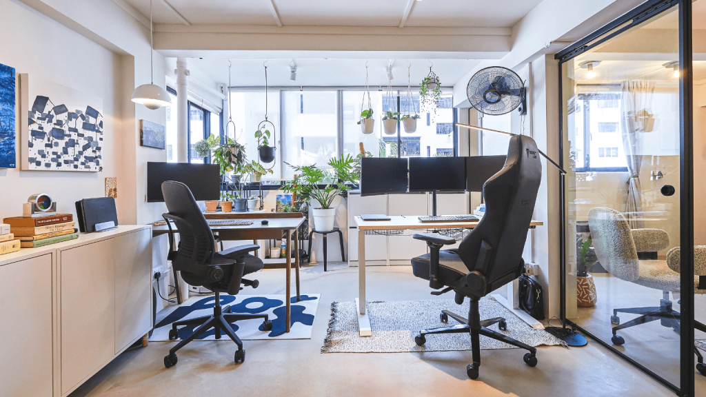
To facilitate the flow of natural light, the wall partition between the balcony and the adjoining home office, was removed. “Our workspace is now brighter. And with the balcony garden, we get to enjoy the sight of greenery, along with fresh air, whilst working.”

The home office also doubles up as a recreation room, where Samuel spends most of his time in the reading corner. “I love lounging in the leather armchair – whether it’s taking a break or reading my favourite book. It’s where I spend my me time,” he explains.

Beyond spots of greenery, the room is also decorated with paintings that span across the wall – some of which are painted by Joanne and Samuel, who love experimenting with art. This room, with its colours, is a departure from the rest of the house.

In one of their creations, the home owners had upcycled leftover packing foam peanuts. “We thought it was a waste to throw them out, so we tried to incorporate them into our décor. It turned out surprisingly well and adds some personality to the overall aesthetic,” Joanne chuckles.

Minimalist Design with Retro Influences
Separated by a sliding glass door, the home office flows into the open concept communal area that comprise the living room, dining room and kitchen.

In keeping to the monochromatic theme, the open kitchen is also dressed in white and grey tones, including the marble countertop.


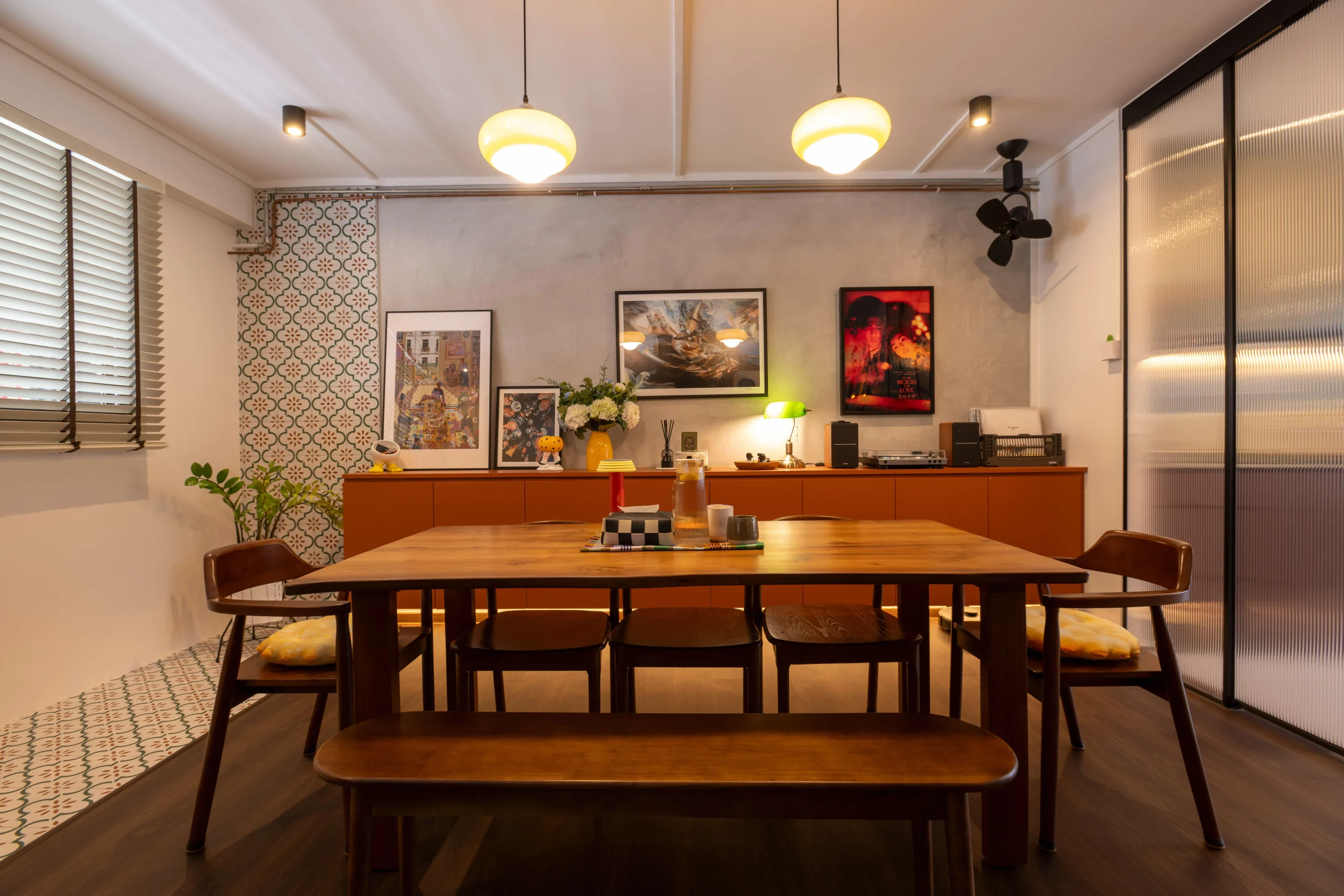
Retro influences are used to give the space its unique look. Take for instance, the old-school wall fans and nostalgic rattan dining chairs.

In the bedroom, the orange hue of the sheets gives off cosy retro vibes. Like the rest of the flat, the design is also kept to the minimum, with a wardrobe being the only carpentry item.

When asked about their favourite spaces in their home, Joanne laughs and says, “It’s a no-brainer for Samuel, it’s definitely the home office. For me, I prefer the living room as it’s my lounge spot and it provides the best view of the greenery at the balcony.”
For more interior inspiration, check out more Home Tours and Design Ideas!
