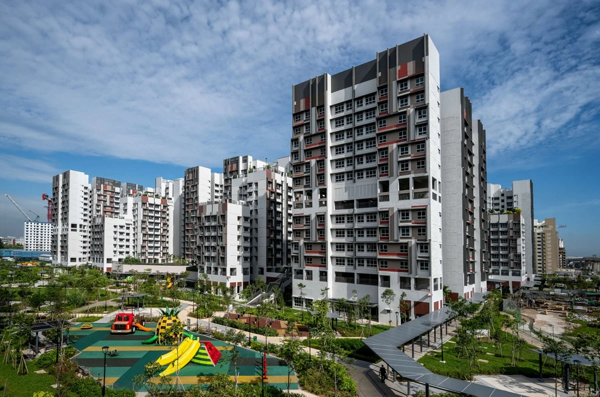
With its local-inspired décor, Peranakan accents and mid-century modern furnishings, Ridzwan and Nadiah’s BTO flat in Kallang is reminiscent of a shophouse – but with a contemporary touch.

Purchasing Their First Home
“We opted for a 3-room flat as we wanted to be comfortable in terms of the space and budget,” Nadiah explains. “We applied for housing grants and made the downpayment with our CPF. This freed up our cash savings for other home-related costs such as renovation works and furnishings.”

“Our home reflects our modern take on a heritage shophouse – perfect for old souls,” laughs Ridzwan.
A Personality-Driven Home
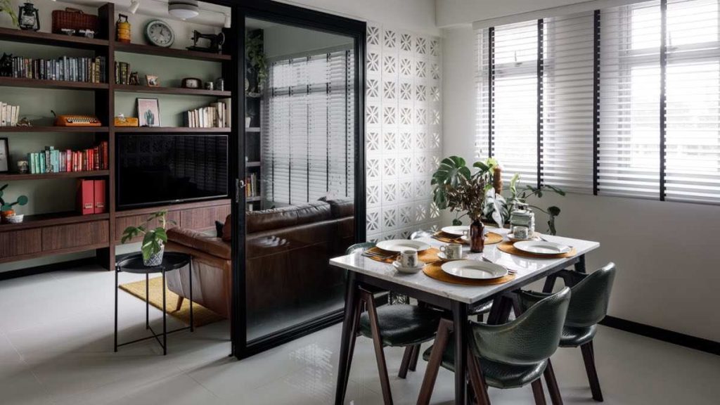
Ridzwan and Nadiah wanted the space to incorporate their lifestyles and personalities. In the living room for instance, the couple demarcated a space for their book collection. “Both Nadiah and I love reading – one of the first things we talked about when we met was our shared love for Enid Blyton books when we were children,” Ridzwan smiles.

In addition to their book collection, the feature shelf also houses the couple’s collection of trinkets, including a vintage clock and tingkats. Family heirlooms such as a typewriter and sewing machine also double as home décor, adding to the nostalgic vibes that carry throughout the space.

When asked to describe the overall look and feel of their home, Ridzwan says, “It’s a combination of mid-century modern and influences from local heritage – in a way, our home design is our classy take on a traditional Singapore shophouse.”
Space Planning
One of the home owners’ priorities is to have a flexible space that can adapt to their changing lifestyle needs.
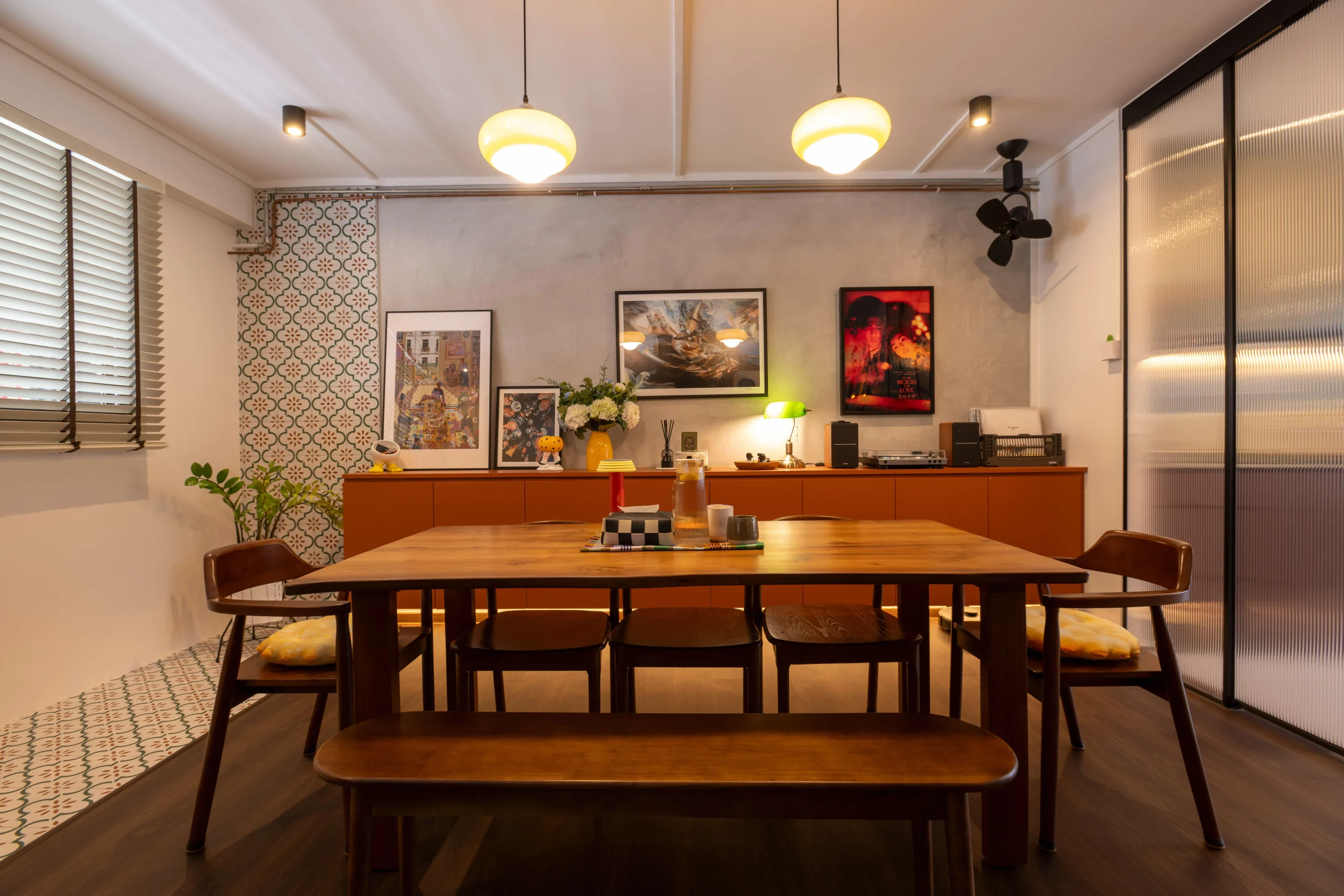
For example, a sliding glass door replaces the wall between one of the bedrooms and the living room, resulting in a semi-open space. While the space is currently being used as the dining area and (?) Ridzwan’s home office, the room can be converted into a nursery once the couple starts a family.

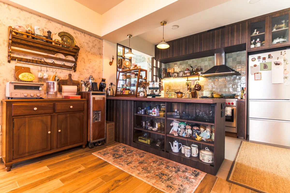
The kitchen and service yard were combined to accommodate an extended kitchen counter.
“We enjoy cooking together, so we wanted a spacious layout that allows us to move about freely as we do so,” says Nadiah. “We love how we could also fit a full-sized pantry while allowing sufficient space for our laundry area.”


One uncommon feature is that the couple did away with a wardrobe in the bedroom. On this decision, Nadia explains, “We wanted to place a vanity table, which is a family heirloom, in the bedroom instead. We figured that having a storage bed and large cabinets in the common areas will meet our storage needs.”

In the en suite, the sink was relocated to the right side of the bathroom, to accommodate an L-shaped counter. “With the fixtures and fittings flushed to the right, the space feels bigger.”

“With the current work-from-home arrangement, we have come to appreciate our home a lot more,” the couple laughs. “We usually work in the dining area, so during lunch time, we’d prepare and have our meals and get back to work. In the evenings, the communal area will be transformed to an exercise area for our workouts. We’re really happy with how our home is perfect for both work and play.”
The article was adapted from a version first published on Qanvast.
