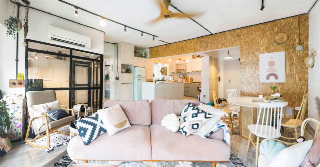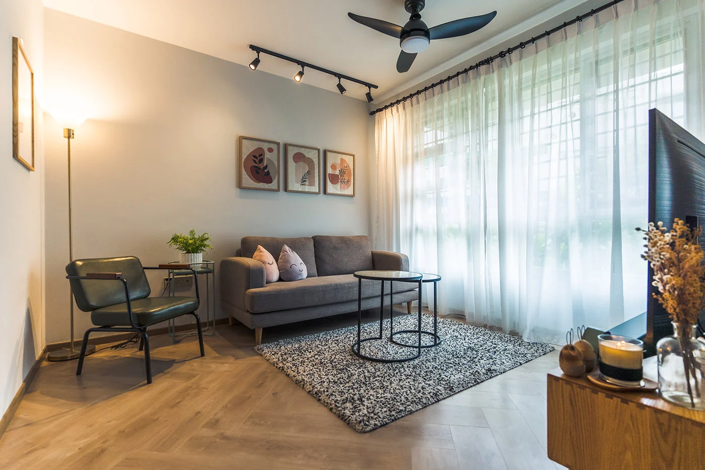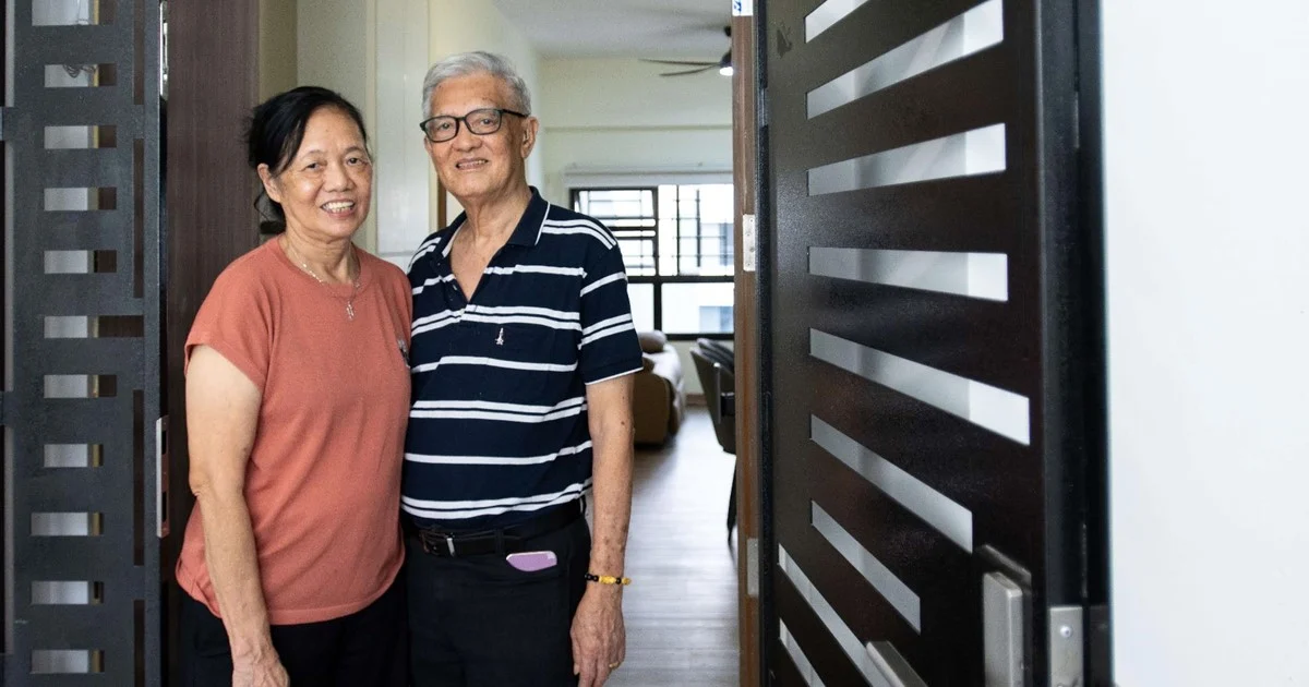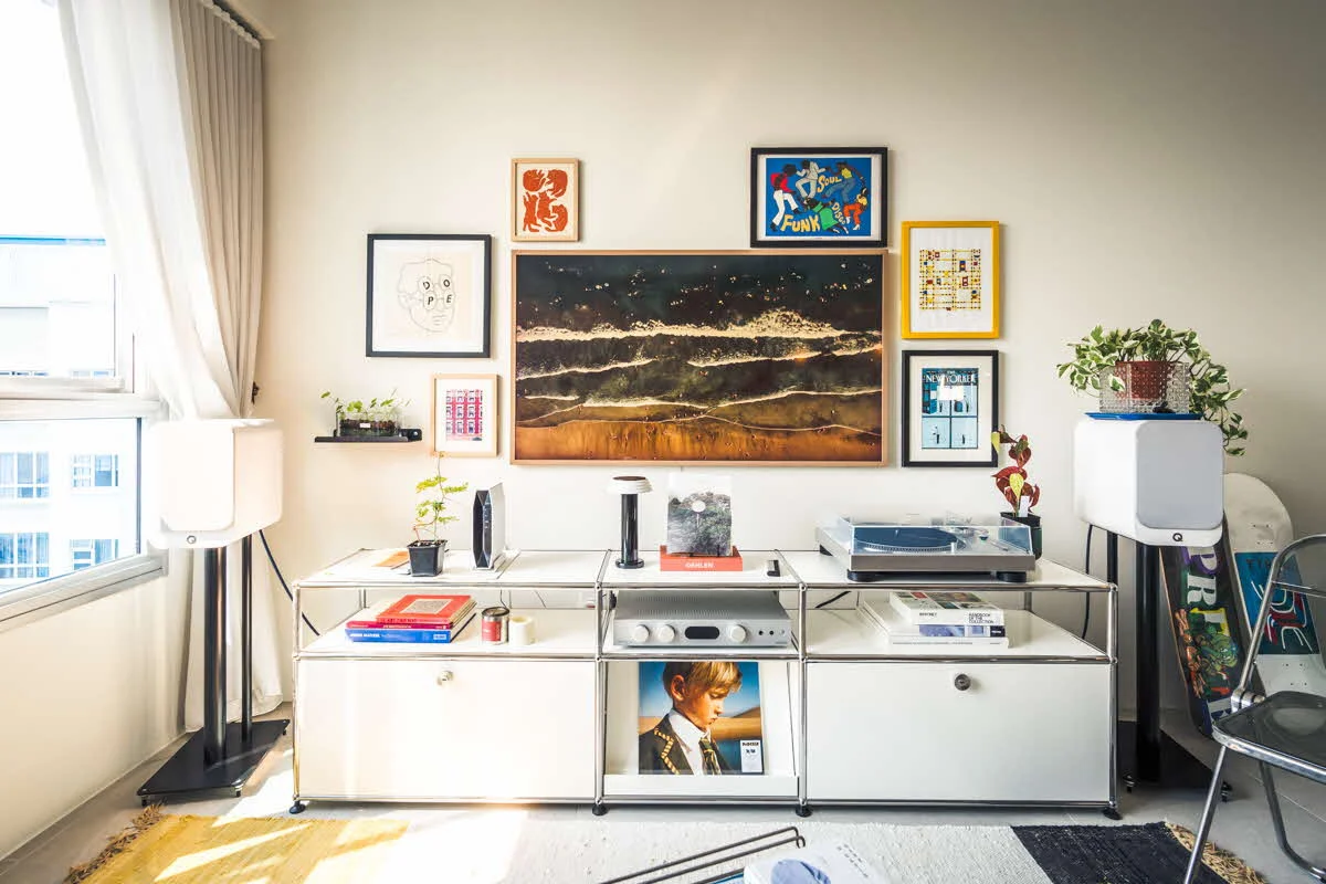
Inspired by Kenny’s preference for industrial interiors and Ruby’s love for pastels and greenery, the couple’s home is a charmingly eclectic space that reflects their personalities.

“I’ve always liked the monochromatic shades, as well as the raw aesthetics of the industrial style,” 38-year-old Kenny says. “Hence, we incorporated elements such as white-washed wooden tiles and black track lights.”
At the same time, one can’t help but notice pops of colours that extend throughout the home, including houseplants and pastel-coloured furnishings.

“Plants help to liven up the space,” 32-year-old Ruby smiles. “When I was living overseas, the first décor item I bought for my then-apartment was plants – I really liked how they cosy up the space and wanted the same for our home.”
Designing Their Home
Despite their different aesthetic preferences, Kenny and Ruby managed to combine them to form a charming industrial-eclectic style that carries throughout the 5-room flat – a considerable feat, given how the couple had done most of the design work.
“While we do have a constant look and feel for the house, it’s obvious who had a bigger role in designing certain spots of the house,” Kenny laughs as he refers to the dining area that is finished with rattan pieces and pastel-coloured décor items.

“We were also quite particular about the concept – so even though we engaged an interior designer, we played a bigger role in the designing process,” Ruby says. “For instance, Kenny planned the flat layout while we worked on the aesthetics together.”

To maximise the space in their living room, the couple incorporated an extended platform that serves as the TV corner, a small balcony and a lounge area.
“Our living room layout is relatively uncommon, and I wanted to make the best of the space – especially the corners of the room,” Kenny explains. “Instead of a permanent dining area, we opted for a kitchen island on wheels that allows us more flexible use of the space.”

To create the illusion of a bigger space, the couple hacked away the walls of the home office and replaced them with black-framed glass panels. “Not only does the common living area feel bigger, the glass panels also allow more natural light into the home office,” the couple says.

The homeowners’ spatial preference is also reflected in their bedroom. “We opted for the top floor unit as we wanted a higher ceiling,” Ruby says.

This is further accentuated by the couple’s house-shaped canopy bedframe, which also lends the illusion of an attic roof.
DIY Elements
From dabbling in pottery to painting portraits, Ruby shares how her passion for crafts has translated into home projects. “I’ve always wanted to be an art teacher but that didn’t happen,” she laughs. “I like to keep my hands busy, so I would embark on mini DIY projects around the house. For instance, now that I’m spending more time working from home, I decided to spruce up the home office and painted an arc on the wall. I also constructed drawer handles from leather strips, so that it’s easier for us to access them.”

It has been 5 years since they moved in; the couple decided to refresh the flat and recently renovated the bathrooms.

“After choosing and buying the materials, all we had to do was to engage contractors to install the fittings for us,” Ruby shares. “We really enjoyed the process – for instance, we couldn’t decide between powder pink and sage for the bathroom vanity cabinet, so we took to Instagram polls and went with the majority.”

“Renovation never really ends – homeowners will always be on the lookout to improve on or beautify their home!”
